Insurance UX is a trust exercise conducted through forms. Project Woodburn covered the whole arc, from the brand and the web pages that make the first impression to the mobile flows a customer uses on the worst day of their month.
The web pages
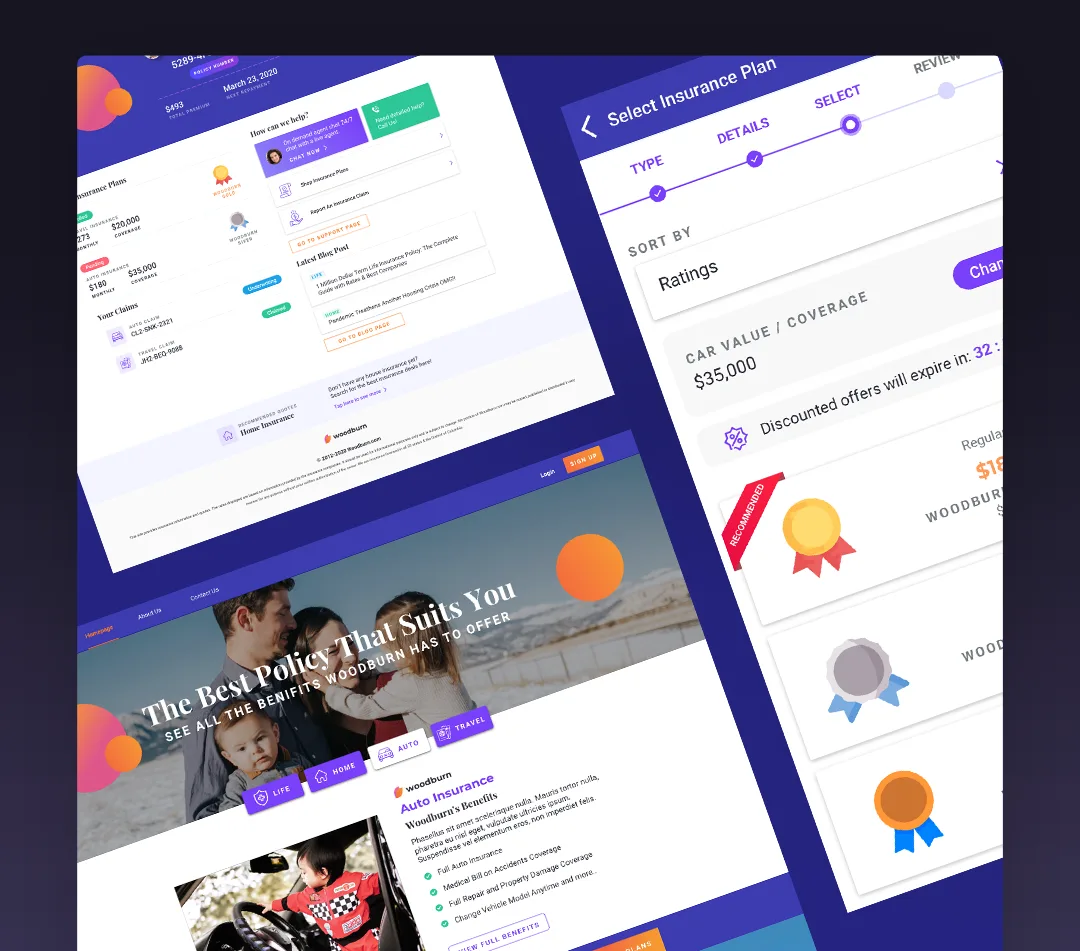
The initial set: home, a sample drill-down insurance page, about us, and the blog. The pages that convince someone this company will answer the phone later.
Onboarding
The onboarding flow explores how to enroll a person into car insurance: what to ask, in what order, and how much a form can carry before a human gives up on it.
The dashboard and plan drill-down
The dashboard's top fold answers the two questions every policyholder has: what is my policy number, and when is the next payment. Below that, the plans they are enrolled in, their latest claims, quick links to help, starting a claim, shopping for other plans, and the latest from the blog. Drilling into a plan shows its details, payment history, and the progress of the insurance process, with a quick line to an agent chat, payments, and coverage changes.
A policyholder opens the dashboard maybe four times a year. It has one job: answer the question they came with, first fold, no hunting.
Claims
The claims flow starts from what the system already knows: it checks which plans the user holds, lets them pick the one to claim against, then walks through the details, hospital reports, incident reports, and the supporting documents and images that make the claim real.
Shopping for coverage
Enrolling in new coverage or changing existing coverage runs through its own flow, so upgrading is not a phone call.