First, some context. Redact is a privacy app that mass-deletes your history across services like Discord, X, Reddit, and Facebook: old posts, messages, comments, wiped on your terms, from one place. Your embarrassing 2014 tweets? Gone. People trust it with the most sensitive thing they have online: everything they've ever said.
I'm the product designer there, and I have been since the early days: sole designer through our runner-up finish (2nd place) at TechCrunch's Miami Spotlight in March 2021, and through the $3.5M valuation that came that September with zero marketing agency help. For most of the app's life it shipped with exactly one theme: dark. This is the story of how it got a second one, and why AI is the reason it finally happened.
Anyone who has worked in a fast-paced, low-manpower startup knows this problem: people have ideas, the ideas get designed, and somewhere along the way they get implemented. But QA? Not so much. The revisions and iterations eat you alive, and the waiting time between each round is the part that really bothers you.
On the graphic design and illustration side for social media, AI already fixed that for us. It freed me up to focus on UX/UI design instead of drawing a bunch of cats for promotions.
On the front end side, the app and the frontsite, not so much. We had to rely on Figma and constantly struggled to keep Figma and prod matching. It's a dance we're all familiar with.
That was the situation until we sat down and started deliberating on our design architecture and the color space we'd been using, so we could finally implement light mode and dark mode. For years, "we don't have the manpower" was the excuse that kept it in the backlog. Once AI took that excuse away, I had no reason left to say no. It forced my hand.
Vampires who hate the light
Redact was a dark mode only application. The reasons were:
- We were all code-brained
- Vampires who hate the light
- We spend all our time in front of a computer
Very shallow reasoning, and we didn't mind it. Until someone put forward this idea:
Security and privacy applications should be in light mode, because light denotes safeness.
And it checks out. Dark is spooky. Hackers operate in the dark, at least in every movie poster ever made. There's something psychological baked into common folk where flat-out darkness reads as threat. It's why kids are afraid of the dark and why no bank paints its lobby black. A dark UI reads as "hacker tool." A light UI reads as "bank." For a privacy product, that perception is basically the product.
And the request wasn't just vibes. Light mode was being asked for because of our privacy theme and branding concerns. We're a privacy company. We should look like one.
That idea stuck with us. I had already created a pseudo light mode for our white-label product for internal and enterprise customers, but that was the extent of it.
So a couple of things made it possible for us to actually implement light and dark mode:
Our CTO enforced a styling framework
Something we could easily review, with a set of form and interactive components built in. That was ShadCN, which uses Radix as its component base, and it has this neat online theme builder called TweakCN where we could quickly preview light mode and dark mode side by side. We also dabbled with Storybook to give visual guidance on what our front end design system looks like, but the manpower is just too low to maintain it.
AI happened
We tested Claude to see if it performs adequately on front end changes, and it did. We also brought in Devin and Cursor as extra agents for code review. I have a little background in front end programming, not really reliable with our front end stack, but confident enough to submit a PR for the programmers to review. With that, I can now be a pseudo front end developer and take my designs 1:1 into production. Which I did.
TweakCN
We started out mapping our color scheme in tweakcn.com. In their own words: "A powerful visual theme editor for shadcn/ui components with Tailwind CSS support."
ShadCN structures its colors into slots like Primary, Secondary, Accent, Base, Card, Popover, Muted, Destructive, Border & Input, Chart, and Sidebar, and each color slot has a background and foreground pair exposed as CSS variables.
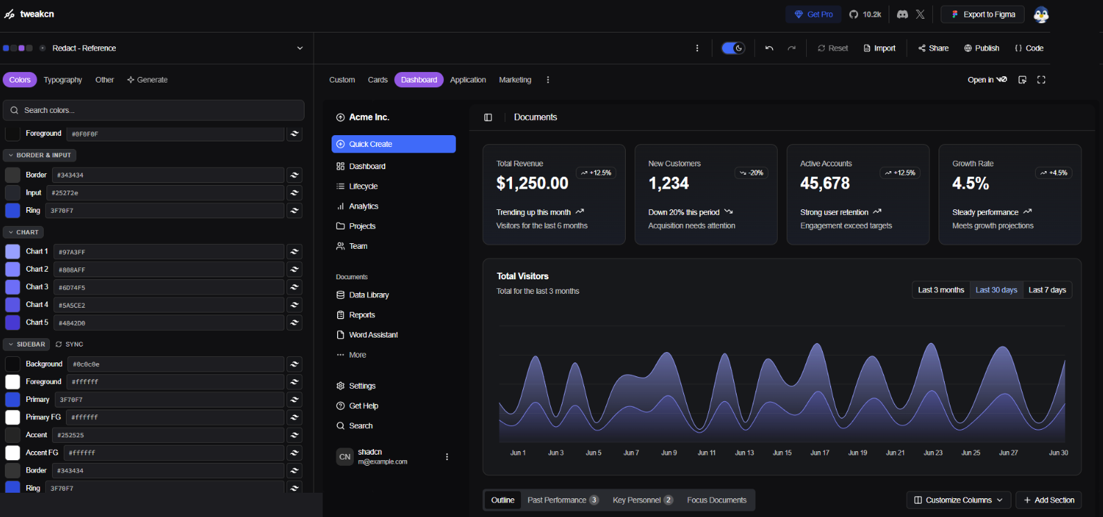
So the export reads like this:
@import "tailwindcss";

@custom-variant dark (&:is(.dark *));

:root {
  --background: oklch(0.9557 0.0080 114.2220);
  --foreground: oklch(0.2178 0 0);
}

.dark {
  --background: oklch(0.1739 0.0041 285.9665);
  --foreground: oklch(1.0000 0 0);
}
That's a sample of the exported code. We use OKLCH because it has more precise color accuracy. But actually because it's kinda new LOL
The annoying part is the hex-to-OKLCH conversion. Depending on the formula a generator uses, you can get a mismatch when converting it back to RGB again.
Anyways, TweakCN also provides a quick preview of how the ShadCN components will look with your theme applied, so getting approval on the colors we're going for is much faster.
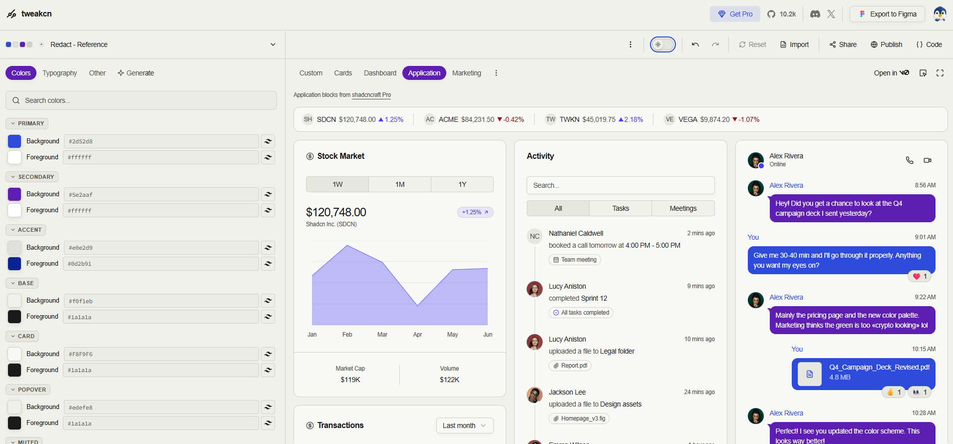
 Dark
Light
Dark
Light
The plus side of using ShadCN is that our color space is limited and our components are fixed. The downside is also the same LOL.
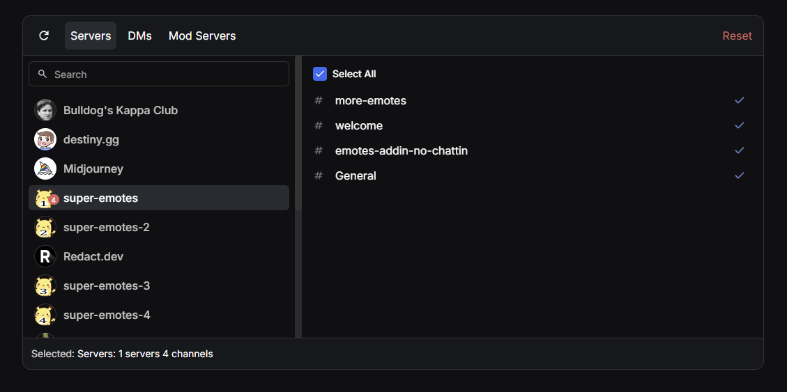
Any variation gets strictly swatted down if it doesn't adhere to ShadCN's preset components. But that doesn't mean we can't be free in designing some of the web elements we need, like this Discord server selector.
The color fights
So, talking about colors. There are a few things that bothered me in theme switching. One is that people with low vision or reduced visual acuity literally could not read some of our text, which is the whole thing WCAG AAA contrast guidelines exist to prevent. The other is keeping the color variables strictly on the ShadCN side.
The first thing we debated on was having a link color distinct from our primary color.
The problem is that when our primary and secondary are used as text, they're washed out. Literally unreadable. The solution is a separate color when they're used for links, icons, and the like.
bg #101012Head to account settings to schedule a wipe, or squint at the privacy policy first.
#3F70F7as link text4.4:1 · AAA ✗#945FE2as link text4.5:1 · AAA ✗bg #f0f1ebHead to account settings to schedule a wipe, or squint at the privacy policy first.
#2d52d8as link text5.6:1 · AAA ✗#5e2aafas link text7.6:1 · AAA ✓I proved the point this way: a button is readable as a solid shape, but as text the surface area is too narrow and the color loses its contrast. So we compromised and added new color variables for those scenarios.
The next one: we use an opaque color as the background for our badges too. So what happens there is the badge background is primary at low opacity, and the text uses the new colors we just talked about, primary-accent or secondary-accent, which are new variables.
bg #101012Head to account settings to schedule a wipe, or squint at the privacy policy first.
#a2c1ffprimary-accent10.5:1 · AAA ✓#c9a8ffsecondary-accent9.5:1 · AAA ✓bg #f0f1ebHead to account settings to schedule a wipe, or squint at the privacy policy first.
#0d2b91primary-accent10.4:1 · AAA ✓#471d86secondary-accent10.3:1 · AAA ✓primary-accent and secondary-accent never paint a surface: buttons keep the originals, links use the accents, and badges pair the original color at low opacity with accent text. All four now clear WCAG AAA (7:1).All these little rules add up, and nobody remembers them all. That's exactly where consistency starts to rot. So having a skill on Claude documenting these kinds of nuances on how to tackle new code generation for design helps a lot. Those skill files give the AI agent more context to perform the task in a way that matches the outcomes we already agreed on.
And it goes beyond the design nuances. Design reviews, code reviews, rebasing, pushing, pulling, creating a new branch. All the things that used to take more time for us not-technical, not-always-coding people are now easily accessible using AI agents.
The new workflow
So the workflow with an AI agent now looks like this:
-
1
I have a Figma designMe
-
2
I let Claude see itMe
-
3
I ask Claude to recreate it with the presets already in our codebaseMe
-
4
The agent creates itClaude
-
5
Looks good, I push itMe
-
6
Another agent reviews Claude's code and fixes it on the PRAgent
-
7
A developer does the final reviewDeveloper Nothing merges without a human.
A mere designer can now get a front end change up and running without bothering other developers with these minute changes. Basically you have additional manpower to fix your website LOL.
With that said, it still took me a fair bit of time fixing light mode and dark mode across the Redact app and frontsite. This isn't magic, it's just fewer bottlenecks.
One of the pretty cool parts of having a coding agent: they can code a visual placeholder instead of using images. Which is dope. And that coded placeholder can be animated, so it's much faster than loading a GIF or video on your site. A plus for the devs.
Though the additional lines of code are a slight headache for that concession.
The extra manpower was inside us all along
Here's the thing AI actually did for us. It didn't replace anyone. It created additional manpower out of people who were already on the team. A designer who can ship front end changes. A non-coder who can rebase a branch. In a low-manpower startup, that's the difference between light mode shipping now or sitting in the backlog for another quarter.
I think more companies should work this way, and most of them won't, for one reason: people stepping on other people's toes. A designer pushing code feels like trespassing on developer territory. I get it. But nothing here removes the guardrails. Agents review the code, developers still have the final say, and nothing merges without a human. The territory didn't shrink. The team just got bigger.
The point was never to claim anyone's territory. It was to stop losing quarters to a backlog nobody had hands for.
Redact has a light mode now. The security app finally looks like what it is: safe. And it got there because the line between design and development got blurry, in a good way.