Redact does one thing people immediately understand: mass delete your social media history. Old tweets, cringe posts, DMs you forgot existed. Gone.
Some scale, so you know what's riding on this. I have been Redact's only designer since it supported 3 services; it supports 35+ now. Along the way it grew from zero users to more than a million, with over 68 million pieces of online content deleted.
The problem is that Redact now does a lot more than that. Data broker removals. An OSINT scanner that finds profiles tied to your identity. Exposed data monitoring. And the pattern we kept seeing was the same: people install the app, delete some tweets or nothing at all, and never touch the rest. The users who did explore the other services were mostly the paying users we already had. The whole point was to get new and free users in deeper.
This is the story of three attempts at that problem. I am telling it in order because each attempt got the diagnosis wrong in a different way, and the last one finally told us why.
One thing to know before we start: where the diagnoses came from. Support at Redact is all hands on deck. If you have nothing to do, you do tickets. So I worked the queue like everyone else, refund requests included, and a refund request is a churn interview you didn't have to schedule: someone telling you, in their own words, what confused them and why they're leaving. None of the hypotheses below came out of a workshop. They came from watching the same complaints repeat for months.
Attempt 1: automate it
The first theory was that setup effort was the blocker. Connecting accounts one by one is tedious, so let's remove the tedium. We built a browser scan feature: on first launch, Redact offers to scan the browsers on your device for signed-in social accounts and connect them for you, so you can, as the modal says, start deleting faster.
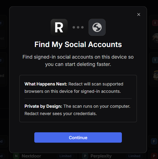
On paper this is great onboarding. In practice, we had built the one feature a privacy product must never lead with. People come to Redact to reduce what has access to their accounts, and the first thing we asked was permission to scan their browsers. The users we talked to told us, anecdotally but consistently, that it felt unsafe. It did not matter that the scan ran locally. It did not matter that the modal said so, twice. We were asking for access before we had shown any value, and no amount of reassuring copy fixes a sequence problem.
You cannot copywrite your way out of asking for too much, too early.
Attempt 2: show everything
The second theory was visibility. Maybe people were not using the other services because the home page did not show them. The old home was a task launcher built around mass delete: pick a platform, go. So we restructured. Social media moved off the center of the home page and became one section among many. Data brokers, discovered profiles, exposed data, the local archive, everything got a card.
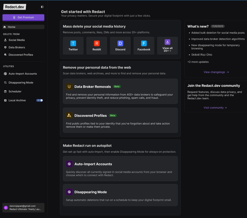
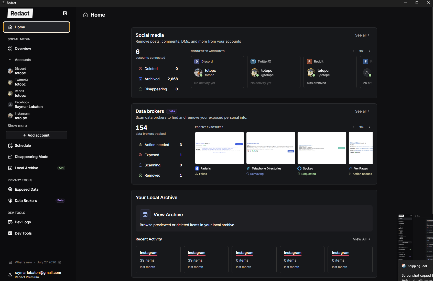
This made the app look like what it had become, a privacy suite instead of a tweet deleter. But it did not move the needle on the actual goal, and looking back, the reason is obvious. A dashboard like this serves the committed user with accounts connected and an archive already filling up. A brand new free user gets a wall of sections, badges, and beta tags. We had confused seeing the services with wanting them. Visibility is not adoption.
Attempt 3: show less, mean more
The suspect this time was visual clutter, and the hypothesis was blunt: free users should not get the same home page as paying users at all. One screen cannot be a working dashboard for one audience and a pitch for another. So we split them, and we simplified the free user home down to two cards.
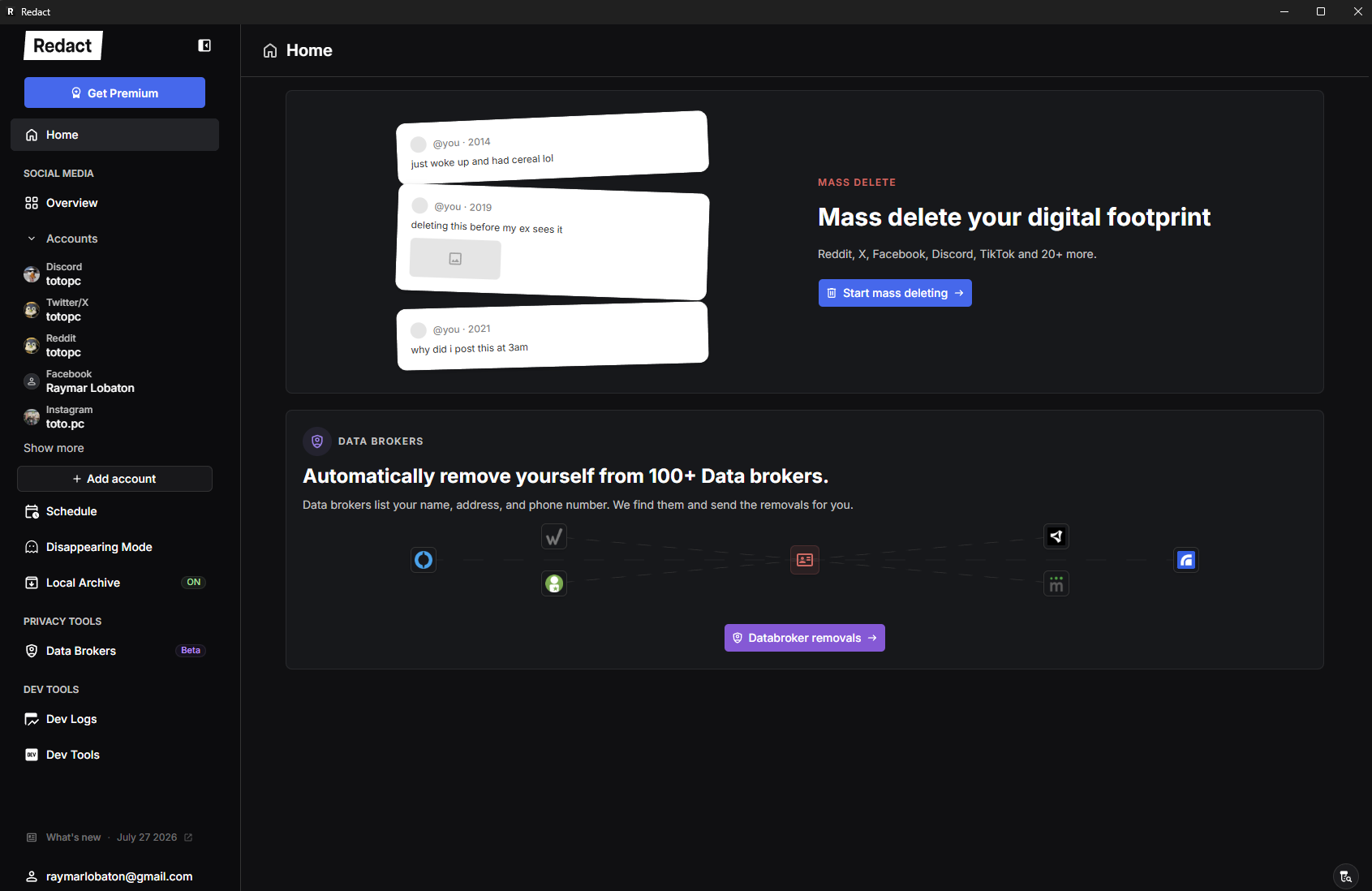
Each card introduces one capability outright and clearly. And the mass delete card does my favorite thing in this whole project: instead of listing features, it shows fake posts. "just woke up and had cereal lol," 2014. "deleting this before my ex sees it," 2019. "why did i post this at 3am," 2021. You do not read that card, you feel it, because everyone has posts exactly like these. The data brokers card works the same way: your name, address, and phone number are listed publicly, and we remove them. A reason before a button.
Notice what neither card does. Neither one asks for access to anything. That was the lesson from attempt 1, applied: show value first, ask for access later. I would love to claim this was a grand unified strategy from day one. It was not. It was us finally listening to what the scan feature failure had been telling us for months.
The numbers
We shipped it as a 50/50 A/B test, new home against old, 9.95K users, 95% confidence intervals, CUPED adjustment on. Here is the scorecard.
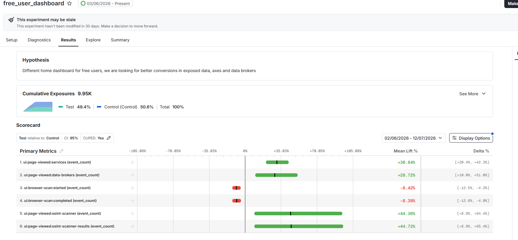
The wins were clean. Services page views up 30.84%. Data broker page views up 28.72%. The OSINT scanner up 44.36%, and its results page up 44.72%, the biggest lift on the board, which tracks: it is the service that shows you something about yourself without asking for anything first.
But the two red rows are the real finding. Browser scan started: down 8.42%. Browser scan completed: down 8.39%. The feature we built in attempt 1, specifically to solve this activation problem, got used less under the winning design. And the two numbers moving together means the people who do start the scan still finish it. Fewer people are being pushed into it at all, and activation went up anyway.
The experiment quietly ran attempt 2 against attempt 3, and attempt 3 won.
The scan did not decline because the feature got worse. It declined because the winning design stopped pushing people into it. The old home leads with automation, the new home leads with value, and the users who saw value first went deeper into the product anyway. Attempt 1's feature fading out of the funnel without activation suffering is the trust problem, finally measured.
One caveat, because I would rather you trust the rest of this article. These are page view lifts, not conversion lifts. The hypothesis on the dashboard says we were looking for better conversions, and what we measured is discovery. More people looking at data broker removals is not yet more people paying for data broker removals. Discovery is the step before the step we ultimately care about. The numbers said ship it, and we did: the two-card home is now what free users get.
What I took from this
Redact still has more services than most users will ever touch, and getting free users deeper into the product is not solved, it is just measurably better. But for the first time, we are not guessing about why.