This one is niche in the best way: a tool for researchers who study infant formula, built with a data scientist who knew exactly what insight the research needed. My job was turning that data into screens a researcher could interrogate instead of scroll.
The dashboard
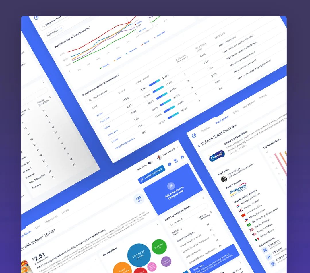
The core view has search, filtering by data source, region, rating, and infant age, and an extensive dashboard of top results by nutrient, ingredient, and more. The graph designs came out of working sessions with the data scientist: the charts show what the study needs to compare, not what looks impressive in a demo.
Product comparison
Researchers pick two or three products off the market and see them side by side: pricing, nutrients, ingredients. The feature every spreadsheet secretly wants to be.
Brand search
Search any formula brand and see every product under it, so brand-level patterns are one query away instead of a manual list.
Supplementary analytics
Around the product data sits the market context a researcher might need: regional use, sales, web search traffic for brands, keyword research, and backlink traffic. The study compares products; this layer explains what the market is doing about them.
The data scientist knew what to measure. The design's job was making the measuring feel like asking questions.