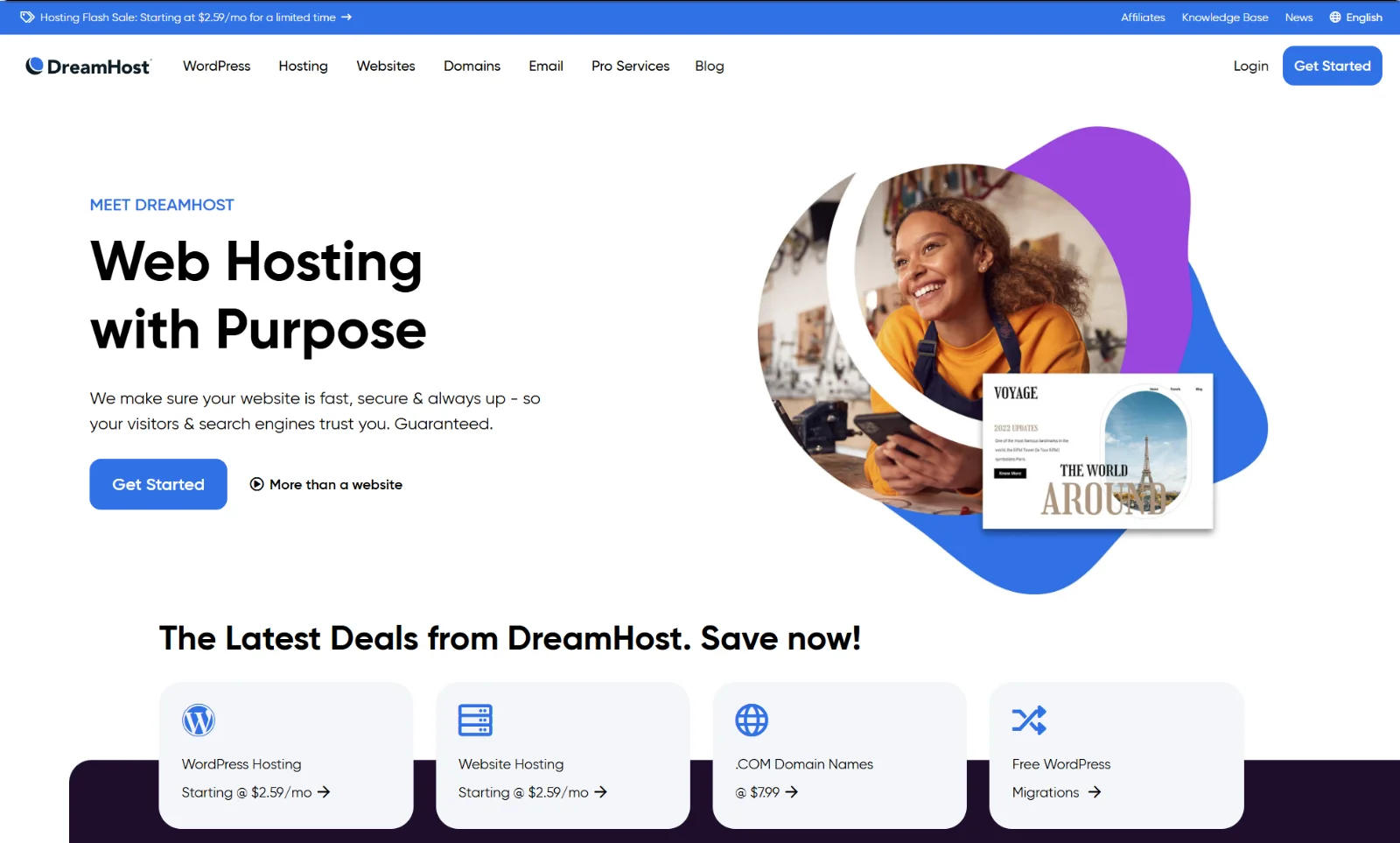
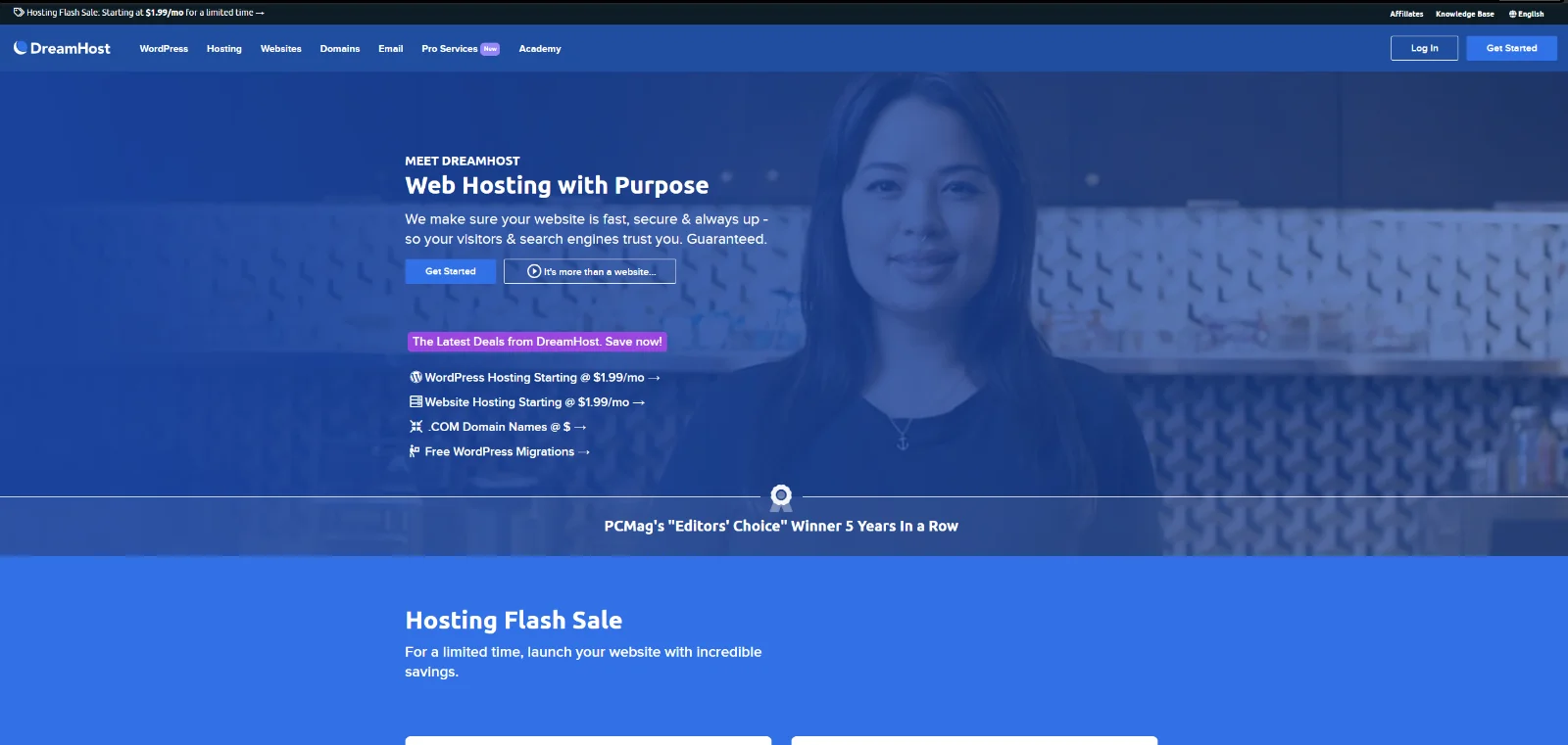
 Before
After
Before
After
I joined DreamHost as your typical product designer. Within months I was leading 8+ designers on Project Phoenix, the long-delayed rebirth of DreamHost's front-site. This is how a stalled redesign finally got unstuck.
The fences
Phoenix had been stalled for years. The designer leading it had left, the team was under-resourced for the scope, and morale around it was low. Worse, the team was chasing a perfect design before showing anything, a classic case of analysis paralysis. Iterations went up to the CEO and nothing got the green light.
Shut up and listen
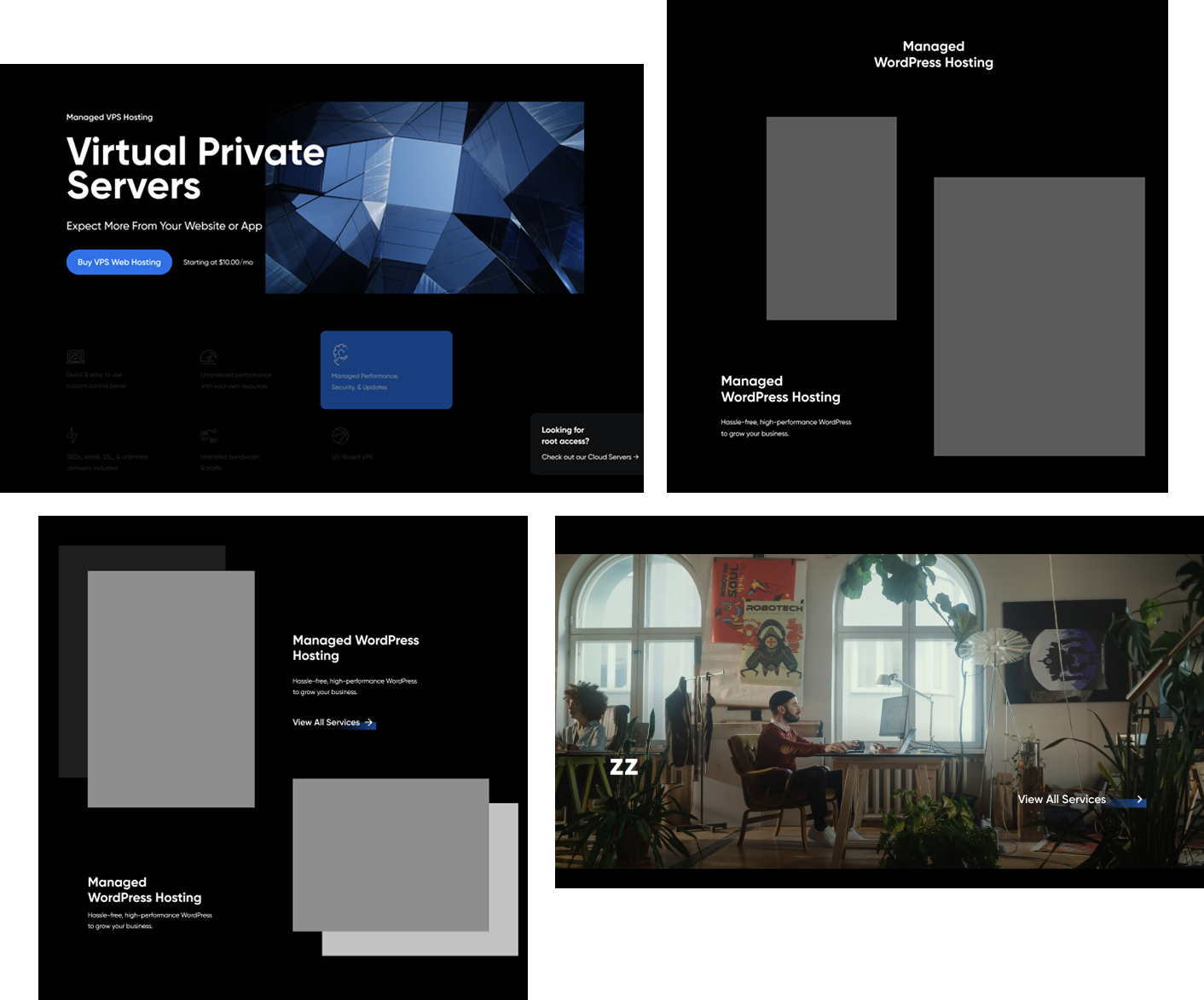
Before designing anything, I spent two to three weeks just talking to everyone who had touched the earlier phases. I learned they didn't want a newcomer's vision. They wanted theirs realized. So I made a deliberate choice: every design decision would come from them. I would be the guiding hand, not the enforcer.
When I arranged their ideas into components and sample pages, I was holding up a mirror. They could reject it, but they couldn't deny it was their vision. That's accountability by design.
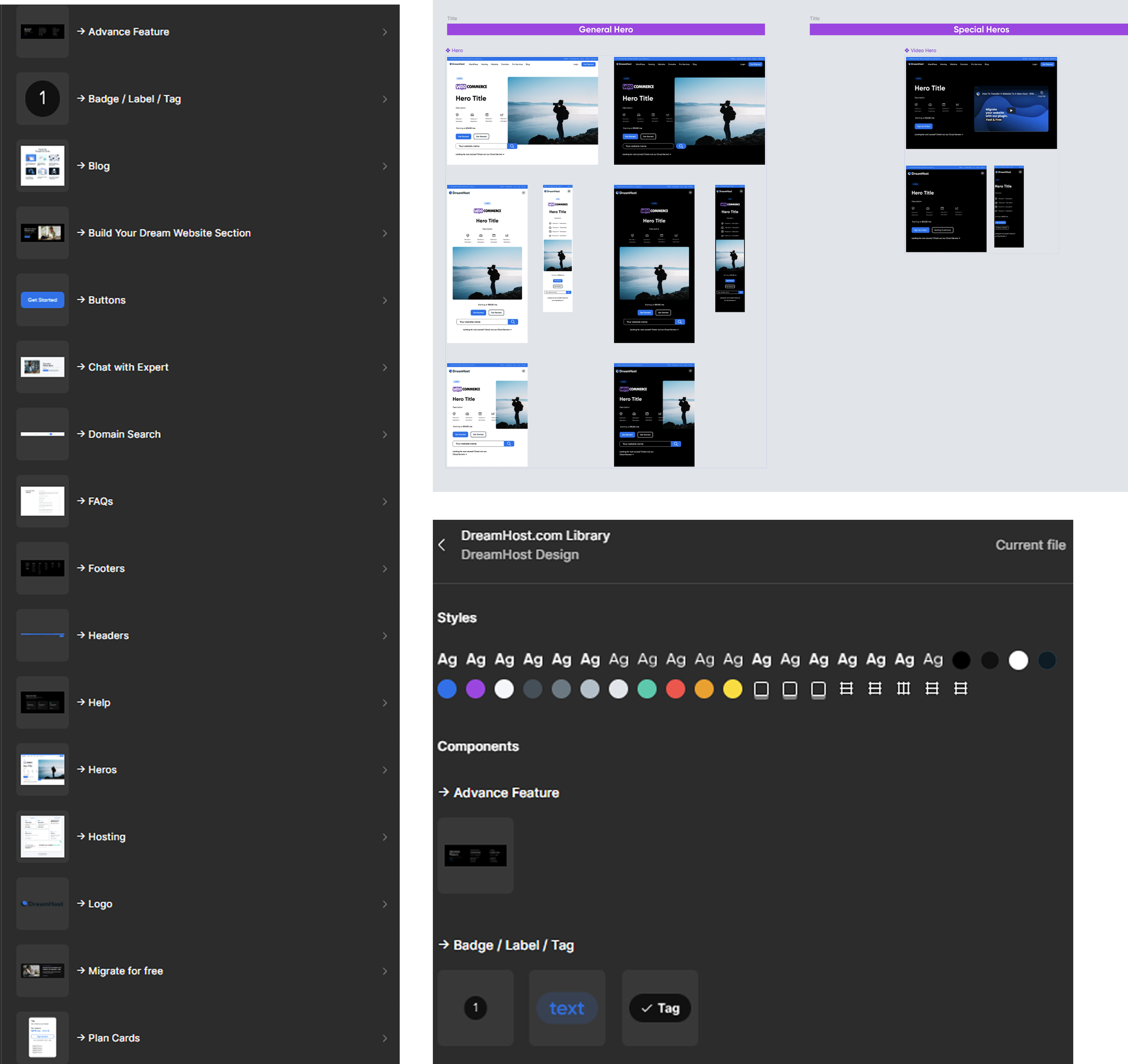
The result: a working component base with navigation, hero, footer, and two full landing pages, ready to present to the CEO.
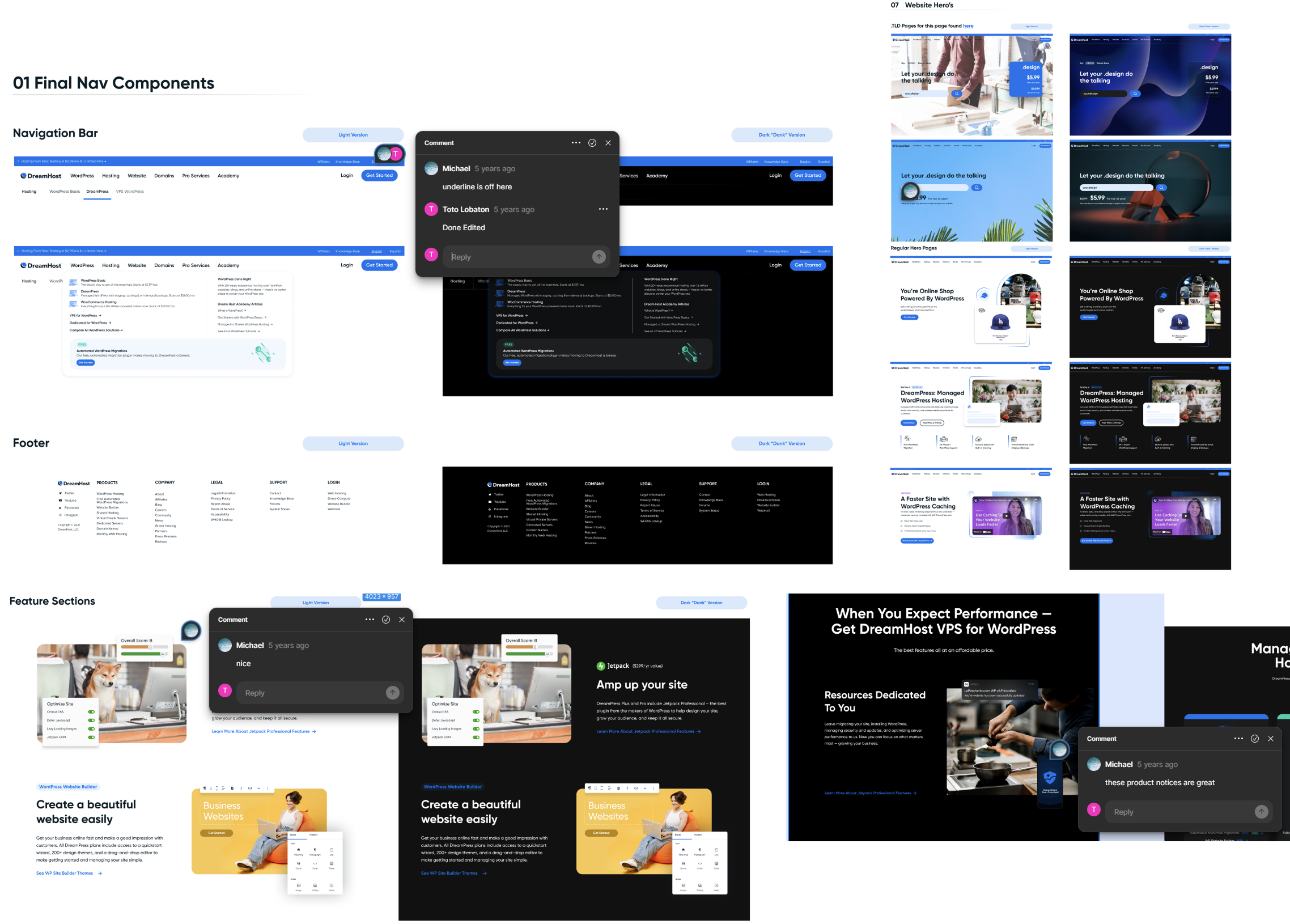
Then, a fence. The team's lead idea-maker, the same person I had spent weeks learning from, stepped back and insisted the landing pages should carry his hand, not mine. We debated. I was blunt: I'm new here, but I deliver on time, and nothing stalls a project I'm on. If that happens, I'd flood the review queue with designs myself if I had to. We settled on an ultimatum: one more week for his version, then we present.
The green light
The presentation happened, and the CEO agreed on the overall feel. The machine finally started moving. The lead idea-maker shifted to building the front end, which was fair: he was faster at developing, I was faster at designing. He also set up the initial components, sizes, and grids, and I agreed to all his suggestions and said nothing. The ball was rolling, and that mattered more than my opinions. Another designer was assigned to audit approved components into our Figma asset library.
The operation
A project manager, coordinating with the Head of Marketing, audited 200+ front-site pages and sorted them into three buckets: top-priority pages that needed extra care, repeating layouts we could templatize, and pages owned by other product owners who needed to sign off. From there, two managers and a scrum master distributed assignments across all 8 designers.
Almost all the major pages landed on me. In my first month I had become "that guy who moves the design forward," and they made it official: lead designer for the project.
The review process
Everything compiled into one Figma file for stakeholders. Each designer got a turn presenting, in pairs: one demos and talks through the designs, one takes notes and comments. This ran for 3 to 4 months until every page was done.
I presented first. Not to brag, but I will brag: my pace was about 10 fully polished web pages a week, complete with content and fully componentized. Two designs a day, no overtime.

The first thing out of my mouth when the PM told me I'd present first: "So if they don't like it, do I get fired on the spot?" She chuckled and said no. My anxiety did not go down after that, but I pushed through, and the first review was a success. We iterated like this until the entire site was designed.
What dragged, and what I learned
- Componentizing is brutal. I remember 10 iterations of a single plan card across mobile, tablet, and desktop. I don't mind. I'm a designer, iterating and delivering is the job.
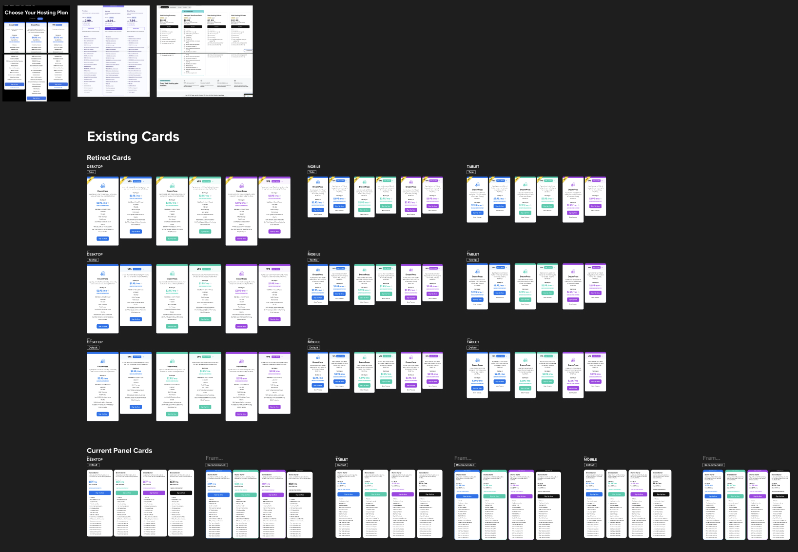
- Enforcing the design language without grabbing the mouse. People would use the wrong corner radius or a raw font size instead of the style. My old self would jump into their file and fix it. Instead I learned to point it out and let them fix it themselves.
- Not getting over my head. I made the bulk of the design iterations, the design language, and the patterns behind them, but the team carried real weight too. No room to get full of myself.
- Stakeholder reviews are chess. Giving every designer stage time was a breath of fresh air, and we'd strategize together: say it like this, frame it like that, tailor the design so the higher-ups see what they need to see.
- The honest one: this redesign was stakeholder-centric, not customer-centric. It reflects what stakeholders wanted the site to be, not what customers wanted or what won in testing. Stakeholders enforcing their will over the data? Almost every time. You realize it, put your head down, and design what they want to see.
Where it landed
After all the designs were delivered, the project moved into phase 2, the refinishing process, plus another phase for a different product owner that I won't get into here.
The redesign launched in 2023. Today we're updating parts of the design language again to keep pace with where the design world is heading, and that's exactly the point: we built a stable design system base that makes iterating easy. The system didn't just ship a website, it survived contact with the future.
Now, the part where a portfolio article usually shows you a hockey-stick graph. I went looking for the numbers: lift in user signups, website impressions, conversions from the front-site. I asked around the company. Zilch. Those metrics simply weren't captured for 2023 to 2024, and that's a bummer. Remember lesson 5? A front-site that wasn't measured is the other side of that same coin.
I could have lied and told you THE PROJECT WAS A HUGE SUCCESS with made-up percentages. Plenty of case studies do. Instead, here's what I can honestly claim: a redesign that was stalled for years shipped, 200+ pages went live, and the component system we built is still what the team designs with today.
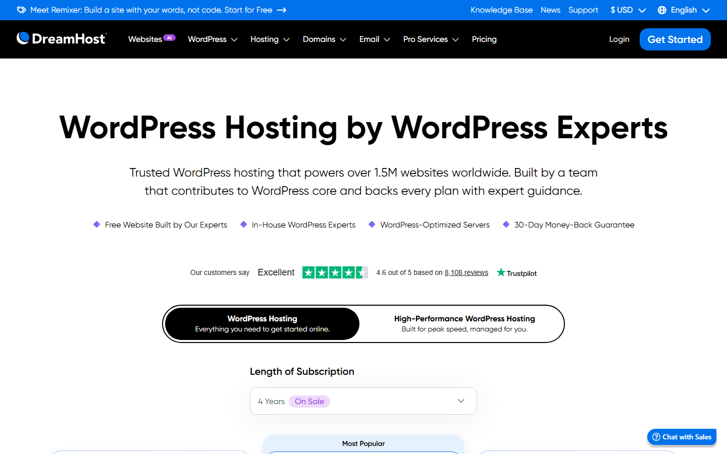
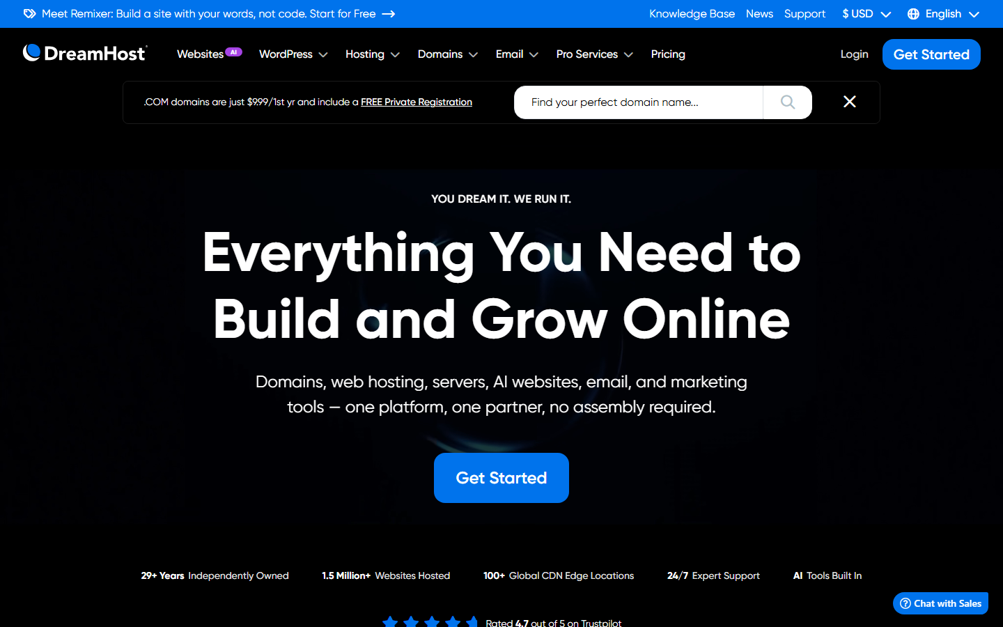
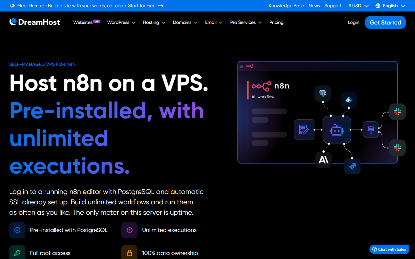
And that's the story of how we redesigned dreamhost.com.